
How to Edit the Navigation Menu in Squarespace
Your squarespace website navigation serves as the roadmap that guides visitors through your content. A well-organized main menu can make the difference between a visitor staying on your site or leaving immediately. Understanding how to edit navigation menu in squarespace is essential for creating a user friendly experience that keeps people engaged with your content.
Squarespace provides straightforward tools for customizing your navigation bar, from basic page management to advanced design customization. Whether you’re adding new pages, creating drop down menu structures, or adjusting the visual style, the platform offers comprehensive options that don’t require coding knowledge.
In this guide, we’ll walk through every aspect of editing your squarespace navigation bar, covering everything from accessing the basic settings to implementing advanced customization techniques that will help your site visitors navigate seamlessly across all your pages.
Accessing Your Navigation Menu Settings
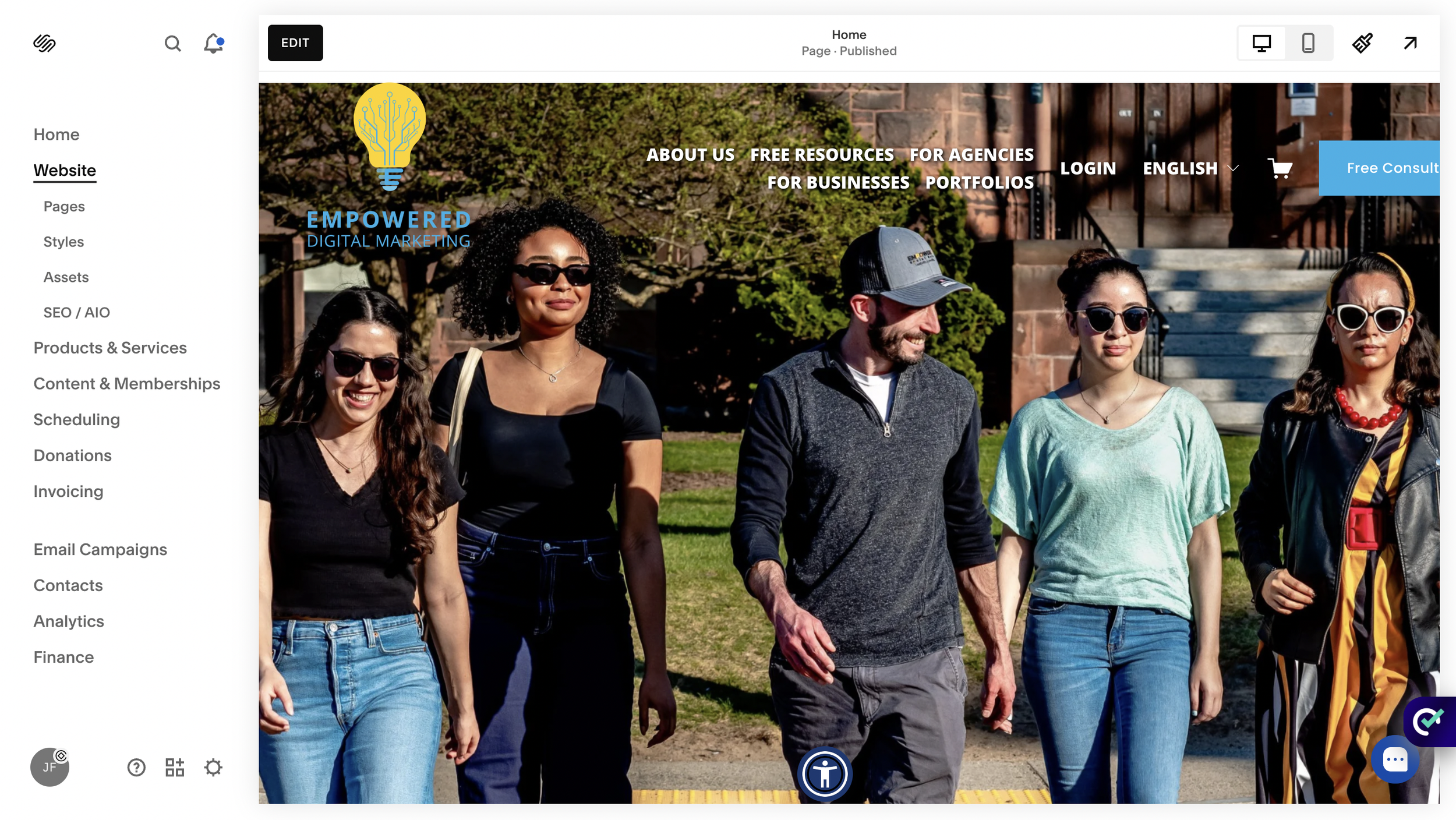
To begin editing your navigation menu in squarespace, you’ll need to navigate to the pages section in your Squarespace dashboard. This central hub controls all navigation elements across your squarespace website.
Here’s how to access your navigation menu settings:
Log into your Squarespace account and select your site
From the main dashboard, click on “Pages” in the left sidebar
You’ll see your current page structure organized into different sections
The navigation management interface displays two key areas:
Main Navigation Section: Contains your primary navigation links that appear in the site header
Not Linked Section: Houses pages that exist but don’t appear in your main menu
Understanding these navigation sections is crucial for organizing your content effectively. The main navigation section controls what visitors see when they first visit your site, while the not linked section allows you to create pages that are accessible by direct URL but won’t clutter your primary menu.
Each section serves a specific purpose in your overall navigation strategy. The primary navigation should contain your most important pages that visitors need to access quickly, typically limited to 5-7 main items for optimal user experience.
Adding and Removing Pages from Navigation
Adding new pages to your navigation menu is a straightforward process that can significantly expand your site’s functionality. The process involves using the plus icon next to primary navigation to create fresh content areas for your visitors.
To add new pages to your navigation:
In the pages panel, locate the plus icon (+) next to your main navigation section
Click the plus icon to reveal page type options
Select your desired page type (Standard Page, Blog, Gallery, etc.)
Name your page with a clear, descriptive title
The new page automatically appears in your navigation menu
For removing pages from your navigation menu, you have several options depending on what you want to achieve:
Complete Page Deletion:
Hover over the page name in the pages panel
Click the trash can icon that appears
Confirm the deletion when prompted
Moving Pages to Not Linked:
Drag the page from your main navigation section
Drop it into the not linked section
The page remains accessible by direct URL but disappears from visible navigation
The drag and drop functionality makes reordering menu items incredibly simple. You can click and hold any page name, then drag it to your desired position within the navigation hierarchy. This feature allows you to prioritize important content by placing it higher in your menu structure.
Moving pages between different navigation sections helps you organize content strategically. Pages in the not linked section are perfect for thank-you pages, specific landing pages, or content that you want to control access to through specific links rather than general site navigation.
Editing Navigation Menu Structure
Creating an effective menu structure involves more than just adding pages - it requires strategic organization that helps visitors find information quickly. The key to successful navigation lies in creating logical groupings and hierarchies that make sense to your target audience.
Creating dropdown menus and subpages adds depth to your navigation without cluttering the main menu bar. Here’s how to create dropdown structures:
In the pages panel, locate the plus icon (+) next to your main navigation section
Click the plus icon to reveal page type options
Click the Dropdown option
Provide a descriptive name for the dropdown
Drag the pages you want underneath that dropdown
For organizing menu hierarchy effectively, consider these strategies:
Group related content under logical parent categories
Use descriptive names that clearly indicate page content
Order items by importance or logical flow
Adding external links to your navigation menu expands your site’s functionality by connecting visitors to relevant resources outside your Squarespace website. To add external links:
Click the plus icon in your navigation area
Select “Link” from the page type options
Enter the external URL in the link field
Provide a descriptive name for the link
Choose whether the link opens in a new window
Setting up folder pages creates organizational containers that help structure complex sites. Folder pages don’t contain content themselves but serve as organizational tools for grouping related pages. When you create a folder structure like “Programs” containing “Undergraduate,” “Graduate,” and “Admissions,” visitors can easily navigate to specific areas of interest.
Best practices for menu structure emphasize limiting your main navigation to 5-7 primary items. This limitation isn’t arbitrary - user experience research shows that too many options can overwhelm visitors and reduce engagement. If you have more content areas, consider using dropdown menus or reorganizing content into broader categories.
Customizing Navigation Appearance
The visual appearance of your navigation menu plays a crucial role in your site’s overall design and user experience. Squarespace provides extensive customization options through the site styles interface, allowing you to create a navigation design that perfectly matches your brand.

To access site styles for navigation customization:
From your main dashboard, click the paint brush icon at the top right hand side of your screen
Here you’ll find some navigation-related styling options
Changing your navigation font family and size impacts both readability and brand consistency. The font options include:
Font Family: Choose from Squarespace’s extensive font library
Font Weight: Select from light, normal, or bold variations
Font Size: Adjust size for optimal readability across mobile devices
Letter Spacing: Fine-tune character spacing for visual appeal
You can also edit the element spacing, link spacing, navigation layout, navigation height, navigation width, and more by:
Clicking the “Edit” button on any page
Hovering over the navigation menu
Clicking “Edit Site Header”
Navigation Layout Options
The positioning and layout of your navigation significantly impacts how visitors interact with your site. Squarespace offers multiple layout configurations to suit different design preferences and functional needs.
Some of the Positioning Navigation Options:
Left Alignment: Places navigation links to the left side of the header layout
Center Alignment: Centers navigation links in the site header
Right Alignment: Positions links to the right, often used with left-aligned logos
Layout Configurations:
Sticky navigation settings control how your menu behaves during scrolling. When enabled, sticky navigation keeps your menu visible as visitors scroll down the page, providing constant access to navigation options. This feature is particularly valuable for longer pages where visitors might want to navigate to other sections without scrolling back to the top.
Header layout configurations with logo placement affect both functionality and visual appeal. Common configurations include:
Logo left, navigation right: Classic layout that works well for most businesses
Centered logo with navigation below: Creates a more formal, traditional appearance
The choice of layout should align with your content strategy and brand presentation. Service-based businesses often prefer clean, professional layouts, while creative professionals might choose more unique arrangements that showcase their design sensibility.
Mobile Navigation Settings
With over 60% of web traffic coming from mobile devices, optimizing your mobile navigation is crucial for maintaining visitor engagement. Mobile navigation behaves differently from desktop versions, typically using a hamburger menu icon to save space while providing full navigation functionality.

Understanding mobile menu behavior starts with recognizing how squarespace automatically adapts your navigation for smaller screens. When visitors access your site on mobile devices, the full navigation menu collapses into a compact menu icon, usually represented by three horizontal lines (the hamburger icon).
Mobile Menu Functionality:
Automatic responsive design that adapts to screen size
Touch-friendly interface optimized for finger navigation
Collapsible design that saves valuable screen space
Full access to all navigation links and dropdown menus
Customizing mobile menu icon style and position allows you to maintain brand consistency across all devices. The customization options include:
Icon Style: Choose from different hamburger menu designs
Icon Position: Place the menu icon on the left or right side of the mobile header
Icon Color: Match the icon color to your brand palette
Mobile navigation color and layout adjustments ensure readability and usability on smaller screens. Key considerations include:
Contrast: Ensure sufficient contrast between text and background colors
Touch Targets: Make navigation links large enough for easy tapping
Spacing: Provide adequate space between navigation items for accurate selection
Font Size: Adjust text size for comfortable reading on mobile screens
Testing navigation on different mobile screen sizes is essential for ensuring consistent functionality. Different devices have varying screen dimensions, and what works on a standard smartphone might not work optimally on tablets or larger mobile devices.
Regular testing should include:
Smartphones: Test on various phone sizes and orientations
Tablets: Verify functionality on both portrait and landscape modes
Different Browsers: Check compatibility across mobile browsers
Touch Functionality: Ensure all navigation elements respond properly to touch
One important technical detail involves hiding the mobile menu icon when no pages are linked to navigation. This prevents the display of an empty menu icon, which can confuse visitors and create a poor user experience.
Navigation Menu Best Practices
Creating effective navigation requires more than just technical knowledge - it demands strategic thinking about user experience and content organization. Following established best practices ensures your navigation serves both your visitors and your business goals effectively.
Writing clear and descriptive page titles forms the foundation of good navigation. Your navigation link text should immediately communicate what visitors will find on each page. Instead of creative but ambiguous titles, use straightforward language that matches what people expect to find.
Effective Navigation Title Examples:
Good Practice
“About Us”
“Services”
“Contact”
“Blog”
Poor Practice
“Our Story”
“What We Do”
“Get In Touch”
“Thoughts”
Avoiding cluttered navigation with too many dropdowns prevents overwhelming your visitors. While dropdown menus provide organizational benefits, excessive nesting creates confusion and can negatively impact user experience.
Strategic placement of social media links requires careful consideration of their purpose and priority. Social media links work well in the footer navigation for sites where social presence supports but doesn’t drive the primary business goals. However, for businesses where social engagement is crucial (like influencers or social media marketers), placing these links in the main header may be appropriate.
Social Media Link Placement Guidelines:
Footer Placement: Best for most business websites where social media is supplementary
Header Placement: Suitable when social engagement drives business goals
Dedicated Section: Consider a separate social media bar for sites with strong social focus
Maintaining consistency between primary and footer navigation helps reinforce your site structure and provides multiple access points to important content. The footer navigation often includes:
Key pages from your main navigation
Additional resources like privacy policies or terms of service
Contact information and social media links
Secondary pages that support your main content
Regular testing of navigation functionality across devices ensures consistent user experience regardless of how visitors access your site. This testing should be systematic and cover:
Testing Checklist:
All navigation links work correctly and lead to intended destinations
Dropdown menus function properly on both desktop and mobile
Mobile menu icon appears and functions correctly
Page loading times remain acceptable with navigation elements
Navigation remains accessible with keyboard navigation for accessibility compliance
Consider implementing a quarterly navigation audit where you review your site’s navigation structure, test all links, and gather user feedback about navigation usability. This proactive approach helps identify issues before they impact visitor experience significantly.
The goal of navigation testing isn’t just to verify technical functionality - it’s to ensure that real visitors can accomplish their goals efficiently when they visit your site. This user-centered approach to navigation design and testing creates better outcomes for both your visitors and your business objectives.
Troubleshooting Common Navigation Issues
Even well-designed navigation systems can encounter problems that affect user experience and site functionality. Understanding common issues and their solutions helps you maintain a professional, functional squarespace website that serves your visitors effectively.
Fixing Broken Navigation Links
Broken navigation links create frustration for visitors and can damage your site’s credibility. Common causes and solutions include:
Deleted Pages: When you delete a page but forget to remove it from navigation, the link becomes broken. Solution: Check your pages panel regularly and remove navigation links for deleted pages.
Incorrect URLs: External links may break if URLs change. Solution: Regularly audit external links and update them as needed.
Case Sensitivity: Some external links may be case-sensitive. Solution: Always double-check external link formatting when adding them to navigation.
Resolving Mobile Navigation Display Problems
Mobile navigation issues often stem from template limitations or styling conflicts. Common problems include:
Menu Icon Not Appearing: This may occur when your navigation is empty or when custom CSS conflicts with default styling. Solution: Ensure you have pages in your navigation and check for CSS conflicts.
Navigation Overlapping Content: This can happen with sticky navigation or custom CSS. Solution: Adjust header layout settings or modify custom CSS to prevent overlap.
Solutions for Navigation Not Appearing Correctly
If your navigation doesn’t display as expected, systematic troubleshooting can identify the cause:
Clear Browser Cache: Old cached versions may show outdated navigation
Review Custom CSS: Custom code may conflict with default navigation styling
Verify Page Settings: Ensure pages are properly configured and not set to “not linked”
When to Contact Squarespace Support
Certain navigation issues require professional assistance from Squarespace support:
Platform Updates: If navigation breaks after Squarespace updates
Complex Custom Code Issues: When custom CSS creates unexpected problems
Account-Specific Problems: Issues that seem unique to your particular site
Before contacting support, gather relevant information:
Detailed description of the problem
Browser and device information where the issue occurs
Screenshots or screen recordings showing the problem
Any recent changes you made to the site
Conclusion
Mastering how to edit navigation menu in squarespace transforms your website from a simple collection of pages into a sophisticated, user friendly platform that guides visitors seamlessly through your content. The tools and techniques covered in this guide provide everything you need to create professional navigation that serves both your visitors and your business goals.
From accessing basic navigation settings to implementing advanced customization techniques, squarespace offers comprehensive solutions that work across desktop and mobile devices. The platform’s intuitive interface makes it possible to create complex navigation structures without requiring coding knowledge, while still providing flexibility for those who want to implement custom solutions.
Remember that effective navigation design extends beyond technical implementation. The best navigation menus prioritize user experience, maintain consistency across your site, and align with your overall business strategy. Regular testing and optimization ensure your navigation continues serving your visitors effectively as your site grows and evolves.
Whether you’re adding new pages, customizing the visual appearance, or troubleshooting navigation issues, the key is to approach each change with your visitors’ needs in mind. A well-designed navigation menu doesn’t just organize your content - it creates pathways that help visitors discover value in what you offer and take meaningful actions on your site.
Start implementing these navigation techniques today to create a more professional, effective squarespace website that converts visitors into engaged users and customers.

